Article Highlights:
Here are four design trends we have our eye on. And you should too.
- Isometric design instead of 3D
- Artistic and bold typography
- Merging 3D and 2D in photos and beyond
- Muted color palettes and earth tones
I’m not going to start off by saying 2020 has been a great year for design. Every year is a great year for design. That’s why design is so amazing.
As a creative community, we are constantly growing, evolving, experimenting, and discovering new ways to approach graphic design. We can’t help but be excited as we look to the year ahead and the creative design moments to come.
Here are four top trends we are looking forward to incorporating in our own design projects and that we anticipate seeing more of in the industry.
1. Isometric design
Isometric design is nothing new, but we expect it to take on new life this year. You’ve probably seen it used on infographics as a way to create a 3D look and feel in a 2D space — and with 2D file size. This technique is particularly eye-catching in illustrations.
Isometric design is a stylized form of 3D illustration or drawing where the perspective is removed. There is no realistic vanishing point in isometric drawings.
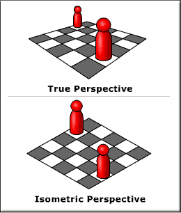
You’ll see more graphics, web page layouts, and other branding materials go isometric, and animation will make these designs even more visually engaging for web design and other screens.
For inspiration, take a look at our 2019 Stoke Holiday Card.
2. Artistic and bold typography
We can’t give enough hype to what’s happening in type. Typography is trending because of the many micro-trends bubbling up all around. Here are a few that every graphic design studio and its clients absolutely need to keep an eye on:
- Serif says hello, again. While the last decade saw serif types fade into the background, they won’t stay there for long. Just take a look at the latest Communication Arts Design Annual awards. More than half of the branding programs that received recognition featured serif type in their projects. And with so many brands currently using sans serif type in their materials, serif type is a great way to stand out.
- Decorative and artistic type. As designers experiment and play with creating their own type, including with hand lettering, you’ll see a burst of artistic typography. The characters will feature more creative elements, nature themes, and geometric shapes. Intricate and extravagant, each symbol will become a work of art and a way to express ideas.
- Heavy and happy. Type is embracing its thickness. Heavy fonts will continue to pop out at us from signs and print materials.
3. Merging 3D and photography
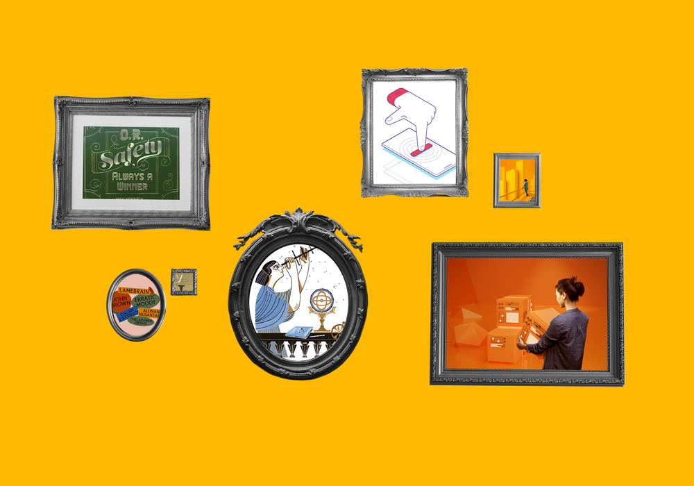
As the isometric design trend shows us, 3D is here to stay. This year, expect to see 3D merge with other dimensions to create surreal realism at its best. For instance, you’ll start to see an explosion of designs incorporating real-life people and objects with digital 3D or 2D illustrations.
3D compositing with photos and 2D objects creates captivating images and new ways of interpreting the world around us — and the worlds we create in our minds.
4. Earthy and muted color palettes
Pantone’s color of the year for 2020 is Classic Blue — a strong, natural blue that blends well with the earthy tones and muted color palettes that we will see paint the creative canvas this year.
This retro-inspired earthy color scheme allows designers to capitalize on past nostalgia and paint a futuristic feel at the same time. The earth tone palettes bring to mind the color schemes of the 1990s, when both individuals and corporations turned to browns, beiges, and burgundies for their design needs. By desaturating the bright colors or even neons from years past with black, white, or another complementary color, designers can play with the endless possibilities of a muted palette. These designs will feel less invasive and abrasive than their more vivid counterparts.
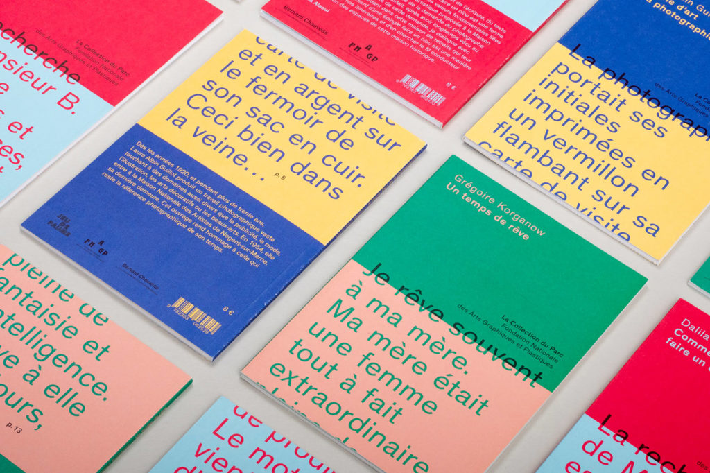
https://www.behance.net/gallery/82202263/La-collection-du-parc
But don’t be deceived by the word ‘muted’ — combined with patterns and textures, these rich tones speak volumes.
Ready to put these trends into play in your creative strategy? Stoke can help. Let’s set up a time to talk.
Schedule a free consultation today.